Stride
Context
Whiteboard tools like Miro and FigJam work well with a mouse. With a stylus, they fall apart.
Every time you need to switch from the pen to the eraser, or from freehand to a shape, you have to move your hand down to a fixed toolbar. Then back up to the canvas. Then back down again. The creative flow breaks every few seconds, not because of the tool's features, but because of where the controls live.
The problem isn't what these tools can do. It's how they make you reach for it.
Challenge
I started from scratch. No existing product to redesign, no AI-generated MVP to fix. Just a friction I kept hitting and wanted to solve.
The build used Claude Code with F# (Fable 5). The goal was a collaborative whiteboard where your hands never leave the stylus or the working area.
Two core mechanisms:
A radial menu triggered by the stylus button.
It appears exactly where you're drawing. No hand travel to a fixed toolbar, no context switch. You stay in the zone.
A snap mode.
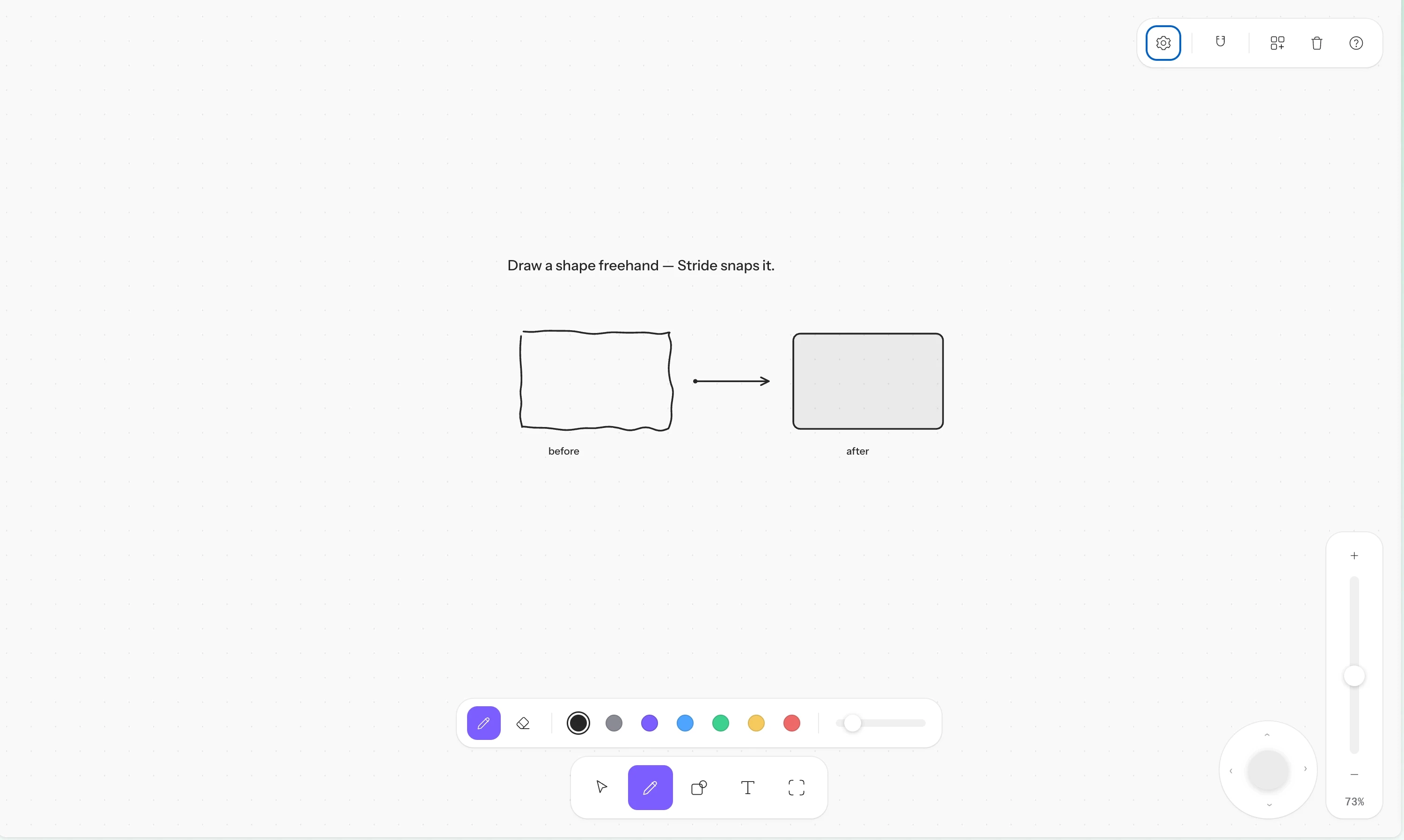
Draw a rough circle, it becomes a clean circle. Draw a rough rectangle, it becomes a clean rectangle. No shape picker, no menu. You sketch, the tool interprets.
Process

Research sketches — early UX exploration

Research sketches — continued
Decisions
The radial menu replaces the toolbar for stylus users.
On a traditional whiteboard tool, switching tools means: lift hand from canvas, move to toolbar, click, move back, resume. The radial menu collapses that to: press stylus button, select, continue. The menu appears at the cursor position, so the interaction stays local. No travel, no reorientation.
The standard toolbar layout

The radial menu — tools appear where you are
Snap mode removes the shape picker entirely.
Instead of opening a menu to select "circle" or "rectangle," you draw the shape freehand and the tool snaps it to a clean version. This keeps the interaction in drawing mode. You never leave the canvas to produce a precise shape.
Snap mode
Arrows are orthogonal only, with deliberate error tolerance.
Arrows snap to horizontal and vertical paths. The turn threshold is set high enough that hand tremor doesn't create accidental corners. If you overshoot, you can pull back without the arrow snapping forward again. Even after committing a turn, you can retrace to undo the corner, as long as you're still holding. A hold (~800ms) on the arrow tip in empty space opens a "continue flow" menu.
The arrow connection button is a filled 8px circle on the frame contour,
scaling to 24px on hover. No stroke + fill, no connecting line between anchor and button. When the button overlaps an existing arrow body, the button takes priority. Connection points use decimal ticks every 16px, with reinforced anchors at center and quarter positions. Arrows stay linked to their frame: they follow on move and reproject on resize.

Arrow handle — the blue button on the frame contour
High contrast mode darkens the UI but leaves the canvas untouched.
On tablets, the canvas renders significantly brighter than on a standard monitor. The default light mode ("Fabric" style: white to #FAFAFA, depth through shadows only, no outlines) becomes hard to read. High contrast solves this by switching the interface chrome to dark while preserving the canvas as-is. Stronger shadows and a #D7D7D7 border reinforce separation.

How the canvas appears on a tablet — too bright for comfortable use
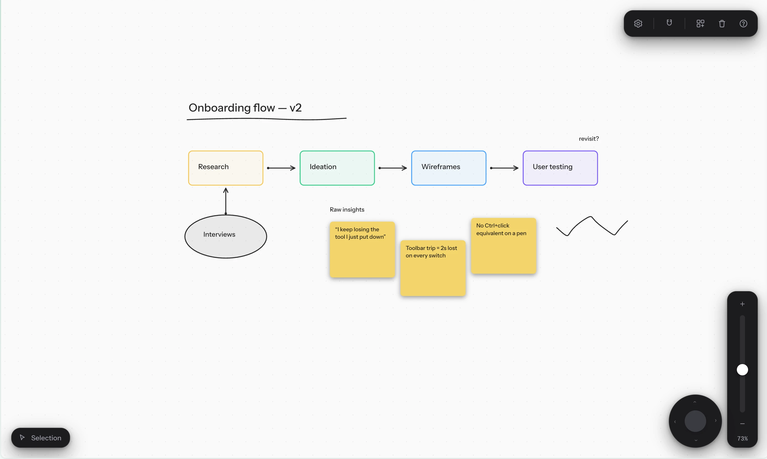
High contrast mode — dark UI, untouched canvas
Left-handed layout.
The joystick and zoom slider reposition to the left side of the screen. A small change, but it means left-handed stylus users don't have to cross their hand over the canvas to reach controls.
Other decisions
Frames & focus mode.
An eye icon appears on hover (top-right of each focusable shape) to enter focus. Inside focus, the frame itself isn't selectable with the selection tool, only its children. Frames grow to contain content but never shrink. Background is tinted to the frame's color at low opacity. No help text in focus, just a centered "Done" button.
UI chrome.
All toggles grouped in a single settings popup (toolbar, radial v1/v2, zoom, joystick), except snap which stays standalone as a simple icon. Top-right corner unified on one background: gear, snap, populate canvas, trash, help. Removed the "Stride" label and purple dot. Toasts display above the toolbar when it's active.

Settings panel — all display options in one place
Micro-interactions.
Scale 0.96 on button press, click zones minimum 40px, popup entry animations, concentric radii on the radial, subtle outlines on images.
Result
I timed the same user flow on FigJam and on Stride. The difference was 4 seconds.
That's not the point. Speed was never the metric. The point is what happens to your hands during those seconds. On FigJam, they alternate between the canvas and the toolbar. On Stride, they stay on the stylus, in the working area, from start to finish.
— Radial menu: zero hand travel to switch tools
— Snap mode: shapes without a shape picker
— Arrows that tolerate error, retrace, and stay connected through resizes
— High contrast that fixes tablet brightness without altering the canvas
— Left-handed layout for stylus accessibility
— Every toggle in one settings panel, not scattered across the UI